Flora
Studio projectAn energy drink that swaps lightning bolts for a flower.
- Category
- Drinks
- Services
- Brand identity
- Packaging
The brief
Energy drinks all look the same: black cans, sharp edges, loud claims. We set ourselves a brief to design one for people who want a lift without the aggression, and who read the label before they buy.
The idea
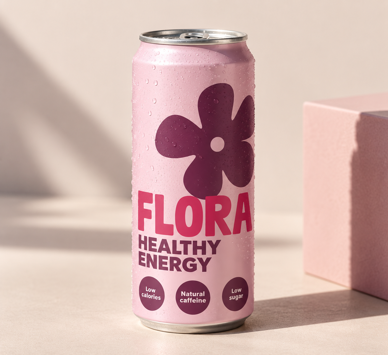
One big, friendly flower. It says natural before you read a word, and it stands out in a fridge full of black and neon. Soft pink, deep plum and a bold, rounded wordmark do the rest.
What we made
Name, logo, can design, and a set of three claim badges (low calories, natural caffeine, low sugar) that can grow into a range.
What it shows
How far a single shape can carry a brand, and how to stand out in a category by doing the opposite of everyone else.
Want to see more?
There's plenty more where this came from.
Next project
Better Hair
Beauty and wellness
See the project